UX Design Process
UX Design for Enterprise Applications in Various Industries.
Manufacturing
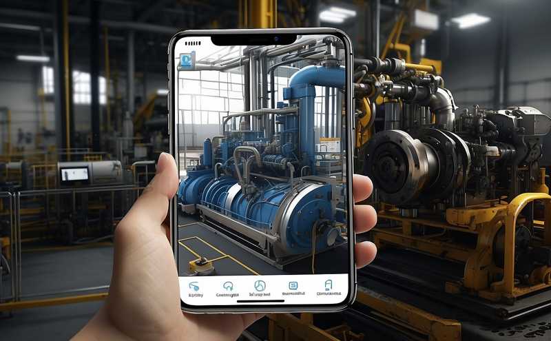
IoT – Application
IoT revolutionizes industries like manufacturing, enabling real-time monitoring, predictive analytics. It optimizes operations, reduces downtime, and enhances efficiency, transforming the manufacturing landscape toward smarter, data-driven processes in a more interconnected world.
The exhaustive UX process tailored for a mobile application within the Manufacturing Industry. Intricacies of creating intuitive solutions designed specifically for this dynamic sector.
Project Overview
This project involves the development of a sophisticated software application tailored to monitor and manage fluid control equipment seamlessly. This intuitive mobile application operates by gathering and processing relevant data via sensors and Wi-Fi connectivity. It’s designed to cater to distinct user levels, ensuring a comprehensive approach to fluid control management.
Distinct User Levels
Technicians: Empowered with detailed insights and functionalities to perform technical diagnostics and maintenance tasks efficiently.
Manufacturing Unit Members: Access to specific tools and data pertinent to the manufacturing processes and equipment functionality.
Facilitators: Oversight and control capabilities over the equipment installed within diverse facilities.
Scope and Reach: The fluid pumps, integrated into this application, serve varied sectors encompassing expansive domains such as prominent hotels, industrial complexes, hospitals, office spaces, and more. Their operational capacity spans across multifaceted environments, facilitating fluid control in diverse settings.
Purpose and Objectives: This project aims to deliver a robust solution, offering real-time monitoring and management of fluid control equipment. By utilizing the capabilities of a mobile application, it ensures seamless access to crucial data, enabling swift decision-making and proactive maintenance across a wide array of facilities.
1. Sales to Delivery

The sales team : After secured the project handed over all critical and relevant project information, including client documents, scope, budget, and timeline to the project management team to initiate the project. The key steps and documents involved in this handover process were:
Project Scope and Requirements Documentation: This included all information gathered during the sales process regarding client requirements, goals, constraints, and expectations.
Proposal or Contract: Outlined project scope, timeline, budget, and deliverables.
Requirement Specifications: Detailed documentation of functionalities, features, and user needs.
Client Communication History: Detailed past communications, discussions, and agreements made during the sales cycle, ensuring continuity and understanding of client expectations.
Stakeholder Contacts and Key Personnel: Introduction to key client stakeholders, their roles, and contact information, facilitating initial communication channels.
Budget and Financial Information: Provided details regarding the agreed-upon budget and milestones tied to payments.
Risk Assessment and Assumptions: Identified risks, challenges, or assumptions made during the sales process that might impact project delivery.
Legal and Contractual Agreements: Shared legal documents, non-disclosure agreements, and specific terms and conditions agreed upon with the client.
Knowledge Transfer Sessions: Facilitated knowledge transfer sessions in some cases to ensure a smooth transition, passing on their understanding of the client’s needs, preferences, and expectations.
Initial Project Plan: Shared a preliminary plan created during the sales process to guide the initial steps.
Client Background Information: Provided contextual information about the client’s fluid handling equipment and market.
The sales team successfully transferred these documents and information, setting the stage for the project team, providing them with the necessary insights and context to kick off the project efficiently and align their efforts with client expectations.
2. Kick-off Meeting
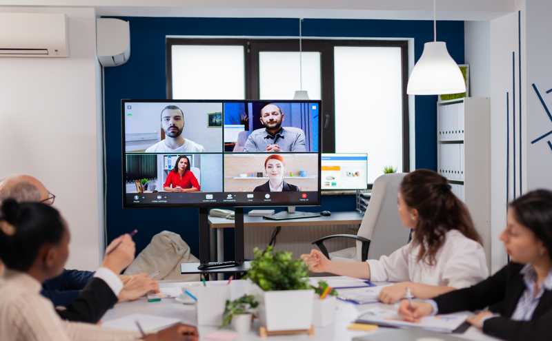
Team Introduction: The project manager introduced the core team members from UX Designers, Developers, and QA to the client and stakeholders.
Project Overview: Discussed the project scope, objectives, deliverables, timelines, and key milestones.
Roles and Responsibilities: Clearly defined roles, responsibilities, and communication channels within the team and with the client.
Risk Assessment: Identified potential risks and mitigation strategies.
Tools and Processes: Established the tools Figma for rapid wireframe, prototyping and creating interactive mockups. Using Jira methodologies for agile project management, and workflows to be used throughout the project. Collaboration Platforms Microsoft Teams for seamless team collaboration and information sharing.
3. UX Roadmap

UX team meeting following the main project kick-off meeting. Three members comprised the UX team, a UX designer, an information architect, and a visual designer.
Introduction and Recap: Briefly reintroduce the project objectives outlined in the main kick-off meeting. Recap key points discussed in the client meeting relevant to UX.
UX Roadmap Discussion: Defined the UX milestones and timeline aligned with the overall project schedule. Outlined key stages of the UX process (research, design, testing, etc.) and their estimated durations.
UX Deliverables Planning: Discussed and defined the specific UX deliverables expected at various project stages. Allocated responsibilities within the UX team for each deliverable.
Tool Selection and Workflow: Evaluated and decide on the tools and software to be used for the UX process. Figma for design, wireframing, and prototyping Mural for UX workshop, UserTesting for research. Established a collaborative workflow within the UX team using project management and collaboration tools Jira.
Research and User Analysis Plan: Defined the approach for user research methods, interviews, usability testing and schedule these activities. Determined how collected data will be analyzed and utilized in the design process.
Design and Prototyping Strategy: Discuss design methodologies wireframing, prototyping and their application in the project. Set guidelines for UI/UX design consistency and usability.
Testing and Iteration Framework: Established plans for usability testing, feedback collection, and iteration cycles. Decided on the frequency and structure of design reviews and iterations based on user feedback.
Documentation and Collaboration Practices: Outlined documentation standards for UX deliverables, ensuring they align with project requirements. Discussed collaboration practices within the UX team and with other project stakeholders.
Next Steps and Action Items: Summarized key decisions made during the meeting. Assigned action items, responsibilities, and deadlines to team members for immediate next steps.
This meeting aimed to align the UX team’s efforts, establish a clear plan of action, and define the tools and processes required to achieve the project’s UX goals effectively.
4. Business Goals

To ensure the seamless alignment of user experience (UX) with our overarching business objectives, a pivotal step involved the meticulous identification of key performance indicators (KPIs) and success metrics tailored for the application. This process was a strategic endeavor aimed at establishing a robust framework for measuring the efficacy of our UX strategies in meeting business goals.
The methodical approach encompassed:
In-depth analysis of business objectives and user needs to define measurable KPIs reflective of both user satisfaction and business success.
Collaboration among the UX team to pinpoint specific success metrics, such as user engagement rates, task completion efficiency, and retention metrics, directly linked to our predefined KPIs.
Iterative refinement and validation of these metrics to ensure they resonated with the core business goals and aligned seamlessly with the anticipated user journey within the application.
This meticulous exercise in identifying KPIs and success metrics served as the cornerstone of our UX strategy, ensuring a focused and measurable approach toward achieving our overarching business objectives.
5. Docs Analysis

The UX design process commenced with a comprehensive examination of the client’s documents, comprising essential materials such as Business Requirement Documents (BRDs), user stories, use cases, and functional specifications. This meticulous review served as the bedrock for understanding the project’s foundational aspects from a user-centric lens.
Key focus areas during this analysis encompassed:
User-Centric Insights: Scrutinizing user stories and use cases to glean insights into user behaviors, needs, and expected interactions with the application.
Functional Specifications Examination: Delving into detailed functional specifications to grasp the intricacies of the system’s functionalities and their alignment with user requirements.
Aligning with Business Objectives: Ensuring a coherent link between the identified user needs and the overarching business objectives articulated within the BRDs.
Identification of Gaps and Opportunities: Detecting potential gaps or areas for improvement, aiming to enhance the user experience and overall usability of the application.
This methodical analysis of the client’s documents laid the foundation for shaping our UX strategy, enabling us to derive valuable insights essential for crafting intuitive and user-centric design solutions that seamlessly align with both user expectations and the project’s core objectives.
6. User Interview

The user interview phase stood as a pivotal element within our UX design process, fostering direct engagement and deep exploration of user perspectives, needs, and pain points. Through these structured interactions, I aimed to glean invaluable insights directly from the individuals who will engage with the application, ensuring a user-centric approach throughout our design journey.
Key facets of our user interview process included:
Identifying User Behaviors and Goals: Engaging with diverse user groups to understand their behaviors, motivations, and objectives when interacting with similar applications or systems.
Exploring Pain Points and Challenges: Delving into users’ challenges, pain points, and frustrations encountered in their current experiences, allowing us to address these within our design solutions.
Validating Assumptions: Verifying and refining assumptions made during the initial project stages by directly interacting with the target user base.
Unearthing Unmet Needs: Probing for unmet needs or latent requirements that might not have been explicitly articulated in the project documents.
My approach to user interviews involved thoughtful questioning, active listening, and empathetic engagement, ensuring a conducive environment for users to candidly express their thoughts and experiences. The insights gathered from these interviews became the cornerstone for shaping user personas, informing design decisions, and driving the creation of intuitive solutions tailored to address genuine user needs.
Crafting a user interview questionnaire involves tailoring questions to gather specific insights aligned with the project goals. Here’s a sample set of questions:
Background Information:
Can you tell us about your role and responsibilities within your organization?
How frequently do you interact with similar applications or systems in your daily tasks?1
Usage and Pain Points:
What are the primary tasks or goals you aim to achieve using this type of application?
Can you describe any challenges or frustrations you encounter when using existing systems for similar purposes?
Are there specific features or functionalities that you find particularly helpful or lacking in your current experiences?
Workflow and Preferences:
Walk us through a typical workflow or process where you might use such an application.
Are there any specific preferences regarding interface design or navigation that facilitate your work?
Expectations and Improvements:
What expectations do you have from an ideal application for this purpose?
Are there any areas you believe could be improved or streamlined in your current workflow using such an application?
Usability and Feedback:
How intuitive do you find the interfaces of similar applications you currently use?
Would you be open to providing feedback or suggestions during the development phase of a new application to ensure it meets your needs better?
Impact and Adoption:
How do you envision this application impacting your daily tasks or work efficiency if it were to address your needs effectively?
What factors do you believe might influence your willingness to adopt and regularly use a new application for this purpose?
Tailoring these questions to the specific context of the project and target user groups will help gather rich insights into user needs, challenges, and expectations, guiding the design process effectively.
7. Data Analysis

The data collected from client documents and user interview session forms a cornerstone in shaping our design decisions and ensuring user-centric solutions. Our meticulous analysis of this data involved a systematic approach to distill actionable insights and guide our design strategy effectively.
Key aspects of our data analysis process include:
Quantitative Data Examination: Scrutinizing numerical data gathered from user interactions, such as click-through rates, time on task, or user engagement metrics, to derive statistical insights.
Qualitative Data Interpretation: Thoroughly analyzing qualitative data from user interviews, surveys, and feedback to identify patterns, preferences, and pain points expressed by users.
Pattern Recognition: Identifying recurring themes or trends across the collected data to understand prevalent user behaviors and needs.
User Behavior Mapping: Mapping user behaviors and interactions with the application to inform the design of intuitive and user-friendly interfaces.
Iterative Refinement: Employing an iterative approach to refine our design solutions based on the insights drawn from the data analysis.
This rigorous data analysis process served as the backbone of our decision-making, allowing us to craft solutions that resonate with user needs, preferences, and behaviors, thereby ensuring a compelling and user-centric design.
8. Design Thinking
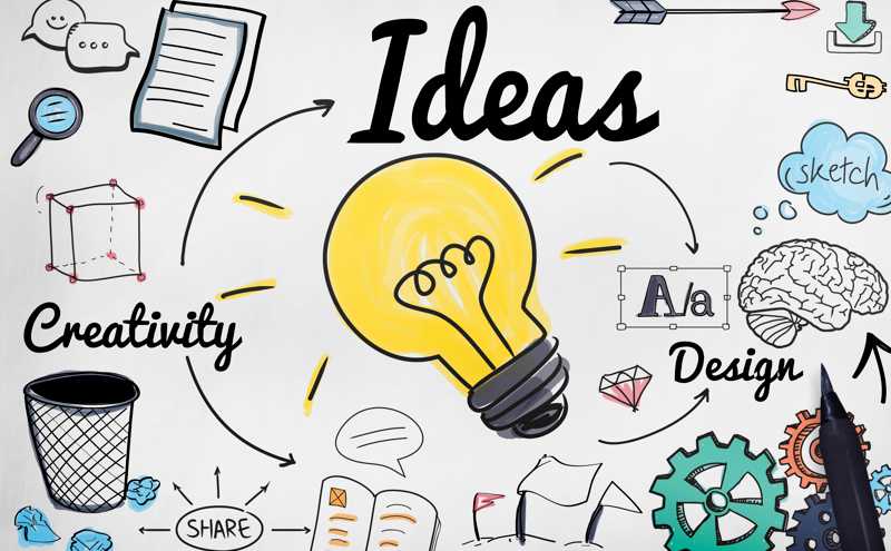
Building upon the insights gleaned from client data analysis, user interviews, and collaborative sessions with diverse stakeholders, our team orchestrated an immersive online design thinking workshop. This creative and interactive session aimed to harness collective intelligence, foster empathy, and ideate innovative solutions tailored to address identified user needs and business objectives.
Key Elements of the Workshop:
Problem Framing: Leveraging the data-driven understanding derived from client data analysis and user interviews, the workshop commenced with framing and refining the problem statement. This step ensured a clear focus on addressing specific user pain points and aligning solutions with business goals.
Ideation and Solution Generation: Through a series of collaborative exercises and brainstorming sessions, diverse perspectives were explored to ideate potential solutions. The workshop facilitated an environment conducive to free thinking, encouraging participants to generate creative ideas inspired by the insights gathered.
Prototyping and Validation: Following ideation, rapid prototyping techniques were employed to visualize and iterate potential solutions. The workshop participants engaged in creating low-fidelity prototypes or conceptual models, enabling quick validation and refinement of ideas.
Iterative Refinement: Feedback loops and iterative cycles within the workshop allowed for continual refinement of prototypes based on insights gathered from stakeholder interactions and user perspectives.
Alignment with User-Centricity: Throughout the workshop, a strong emphasis was placed on ensuring user-centricity by continually referring back to insights from user interviews and data analysis. This approach aimed to align proposed solutions with real user needs and preferences.
By leveraging collective expertise and insights derived from previous sessions, this online design thinking workshop became a pivotal forum for cultivating innovation, driving solution-oriented thinking, and laying the groundwork for user-centric design solutions.
9. Persona
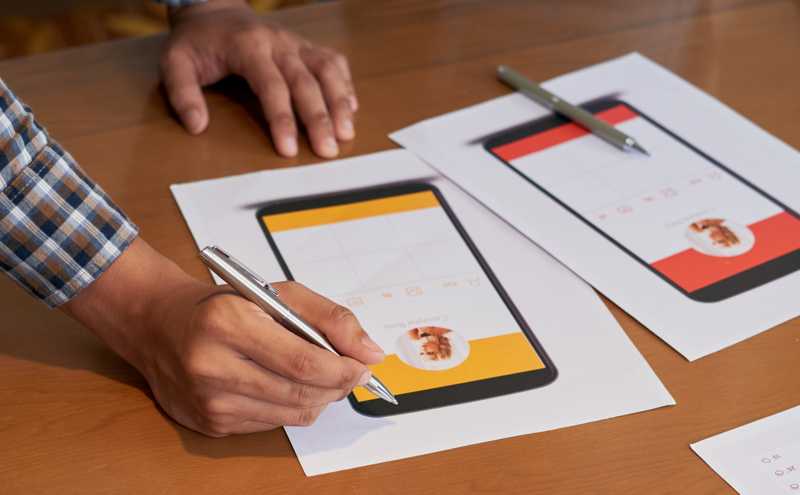
In my pursuit of creating user-centric solutions, the process of persona development played a pivotal role. Derived from comprehensive data analysis, user interviews, and stakeholder sessions, personas served as fictional yet representative characters embodying distinct user groups or archetypes.
Key Components of Persona Development:
User Insights Consolidation: Aggregating and synthesizing insights gathered from various sources, including user interviews, surveys, and data analysis, formed the foundation for persona creation.
Segmentation and Pattern Identification: Identifying commonalities, behaviors, goals, and pain points across user data facilitated the segmentation of users into distinct personas. These personas were characterized by specific needs, preferences, and motivations.
Persona Creation: Personas were crafted as detailed, semi-fictional characters, each embodying a unique user archetype. These personas encompassed demographic details, behaviors, goals, challenges, and narratives reflective of real users.
Empathy and Understanding: The personas were not just demographic profiles but empathetic representations that enabled the team to deeply understand and relate to the diverse user groups. This understanding facilitated decision-making aligned with user needs.
Design Alignment: Personas became instrumental in steering design decisions, ensuring a user-centric approach throughout the design process. Designers referred back to personas to empathize with users, validate design choices, and align solutions with specific user goals and pain points.
The persona development process, rooted in empirical data and user insights, served as a guiding light, enabling us to humanize our design approach, empathize with end-users, and craft solutions tailored to address their real needs and aspirations.
10. User Journey Map

The creation of a user journey map was a pivotal step in visualizing the end-to-end user experience within our application. Derived from comprehensive user research, persona development, and stakeholder insights, the user journey map served as a visual narrative, outlining the user’s interactions, emotions, and touchpoints across their entire experience.
Essential Components of the User Journey Map:
Mapping User Interactions: The map depicted a step-by-step representation of a user’s interactions with our application, from initial contact to task completion. It highlighted key touchpoints, actions, and decision-making moments along the user’s pathway.
Emotional States and Behaviors: Beyond actions, the user journey map encapsulated the emotional states, motivations, and responses of users at each stage. It provided a holistic view of user sentiments, frustrations, and moments of delight.
Identification of Pain Points and Opportunities: By visualizing the user’s highs and lows, the journey map allowed us to pinpoint pain points and areas for improvement. It highlighted critical moments where users might face challenges or experience delight, offering opportunities for enhancement.
Alignment with Personas: The map was intricately connected to the personas, ensuring that each touchpoint and stage resonated with the needs, goals, and behaviors of specific user segments.
Cross-Functional Understanding: The journey map served as a unifying tool, fostering a shared understanding among diverse team members, stakeholders, and decision-makers about the user’s holistic experience.
The user journey map became an invaluable asset, guiding our design decisions, fostering empathy, and enabling us to fine-tune the user experience by addressing pain points and optimizing moments of user satisfaction.
11. Navigation

In crafting a seamless and intuitive user experience, card sorting and navigation played a pivotal role in structuring information architecture and facilitating user-friendly interactions within our application. These techniques allowed us to organize content, design effective navigation pathways, and ensure easy access to information.
Key Aspects of Card Sorting and Navigation:
Content Organization: Card sorting exercises involved organizing information and functionalities into logical categories or groups based on user perspectives. This process helped in defining a clear information architecture aligned with user mental models.
User-Centric Information Structure: Leveraging insights from card sorting sessions, we structured the application’s content and navigation based on how users naturally categorized and related information. This approach aimed to minimize cognitive load and enhance usability.
Navigation Design: The outcomes of card sorting sessions guided the design of navigation menus, labels, and hierarchies within the application. It facilitated the creation of intuitive pathways that users could navigate effortlessly to access desired information or functionalities.
User Validation: Navigation structures derived from card sorting exercises were subjected to user validation through usability testing and feedback sessions. This iterative process ensured that the navigation elements resonated well with user expectations and preferences.
Iterative Refinement: Card sorting and navigation design were continually refined based on user feedback, allowing us to iteratively improve the information architecture and navigation pathways for optimal user experience.
By employing card sorting techniques and meticulous navigation design, we aimed to create an intuitive and user-friendly interface, ensuring users could easily find and navigate through the application to accomplish their goals.
12. Wireframe Making
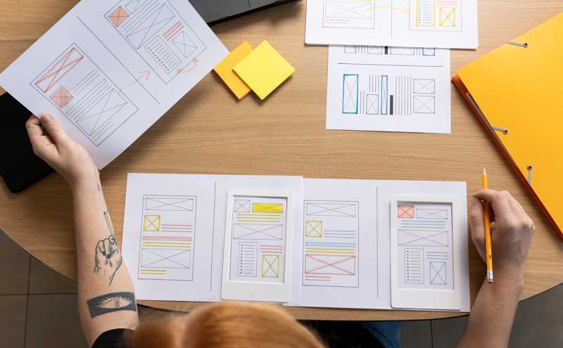
The creation of wireframes served as a foundational step in translating conceptual ideas into tangible, visual representations of our application’s interface. Rooted in user insights, information architecture, and navigation structures, wireframes provided a skeletal framework for the layout and functionality of the application.
Key Aspects of Wireframe Making:
Visual Blueprint: Wireframes represented a visual blueprint outlining the structure, layout, and placement of key interface elements without delving into detailed design aesthetics. This enabled a clear focus on functionality and user interactions.
Functional Representation: They depicted the arrangement of content, navigation elements, and interactive features, offering a tangible representation of how users would navigate through the application and interact with different components.
Iterative Design: Wireframes underwent iterative refinement based on feedback from stakeholders, usability testing, and alignment with user requirements. This iterative process allowed us to validate and improve the usability and functionality of the application.
Responsive Design Consideration: Wireframes often included considerations for responsive design, showcasing how the interface elements would adapt across various devices and screen sizes, ensuring a consistent user experience.
Communication Tool: Wireframes served as a communication tool among design teams, stakeholders, and developers, providing a common visual reference for discussions, clarifications, and decision-making during the design process.
By creating wireframes, we laid a strong foundation for the application’s user interface, enabling us to refine and validate design concepts before moving into detailed visual design, thereby ensuring that the application’s functionality aligns seamlessly with user needs and expectations.
13. Feedback

Upon presenting the wireframe, both stakeholders and users provided valuable insights and feedback, contributing to the refinement and enhancement of the application’s design and functionality.
Stakeholder Feedback:
Stakeholders praised the clear organization of information and the intuitive navigation layout depicted in the wireframe.
Some stakeholders emphasized the need for additional features or suggested modifications to align the application more closely with specific business objectives.
Feedback from stakeholders highlighted the importance of ensuring scalability and flexibility in accommodating future enhancements.
User Feedback:
Users appreciated the simplicity and clarity of the wireframe layout, expressing satisfaction with the ease of navigation and content accessibility.
Several users provided suggestions for minor adjustments in the placement of certain elements to enhance usability and streamline their workflow within the application.
User feedback emphasized the importance of ensuring consistency across different sections of the application for a seamless user experience.
The collaborative feedback from both stakeholders and users was instrumental in refining the wireframe, guiding us toward a design that harmonizes user needs with business goals. Their contributions played a pivotal role in shaping the subsequent iterations of the application’s design, ensuring a more user-centric and impactful end product.
14. VD Estimations

The process of visual design estimation involved the assessment and planning of visual elements, aesthetics, and overall design direction for the application. Drawing insights from wireframes, user personas, and stakeholder inputs, we estimated the visual design scope and outlined the creative direction to ensure a cohesive and appealing user interface.
Key Aspects of Visual Design Estimations:
Design Direction Determination: Based on wireframes and user personas, we outlined a visual design direction that aligned with the application’s objectives and user preferences. This involved selecting color schemes, typography, and defining the overall style to evoke the desired emotions and resonate with the target audience.
Estimation of Visual Assets: We estimated the required visual assets, such as icons, images, illustrations, and graphic elements, ensuring they harmonized with the application’s visual language and complemented the user interface components.
Interaction Design Consideration: Visual design estimations also encompassed planning for interaction design elements, including animations, transitions, and responsive design considerations, aiming to enhance usability and engagement.
Time and Resource Allocation: Estimations involved assessing the time and resources necessary for the visual design phase, considering factors such as design iterations, stakeholder approvals, and alignment with development timelines.
Alignment with Brand Guidelines: Ensuring alignment with existing brand guidelines or creating new design guidelines to maintain consistency in the application’s visual identity and reinforce brand recognition.
These estimations served as a roadmap for the visual design phase, providing a clear direction for design implementation and facilitating a cohesive and visually engaging user interface for the application.
15. Moodboard

In crafting the visual aesthetic and design direction for the application, the creation of a moodboard served as an instrumental step. Leveraging the existing branding guidelines and design elements, the moodboard encapsulated a visual collage of images, colors, typography, and visual styles to inspire and guide the application’s visual identity.
Key Components of the Moodboard:
Existing Brand Elements: Drawing from the established brand guidelines, the moodboard incorporated existing brand colors, logos, typography, and any visual elements that defined the brand’s identity.
Inspiration and Exploration: The moodboard comprised a curated collection of images, graphics, textures, and design elements sourced from diverse inspirations. These visuals aimed to evoke emotions, establish visual themes, and inspire creative direction for the application’s design.
Visual Consistency: The moodboard focused on ensuring consistency between the application’s visual design and the established brand identity. It aimed to unify the application’s aesthetics with the brand’s overarching visual language.
User-Centric Approach: While aligning with the brand, the moodboard also considered user preferences and market trends, striving to create a visually appealing interface that resonated with the target audience.
Facilitation of Design Discussions: The moodboard served as a reference point during design discussions, aiding communication and aligning design decisions among the design team, stakeholders, and other collaborators.
By amalgamating existing brand elements with curated visuals and inspirations, the moodboard provided a visual roadmap, guiding the application’s design towards a harmonious, brand-aligned, and visually engaging user interface.
16. Style Guide
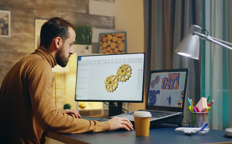
The creation of a style guide and design elements was a pivotal phase that translated the envisioned visual aesthetic into tangible guidelines and assets. This comprehensive guide served as a reference point for maintaining consistency, defining design standards, and streamlining the visual language across the application.
Key Aspects of Style Guide and Elements Creation:
Visual Consistency Framework: The style guide established a framework defining the application’s visual elements, including colors, typography, iconography, spacing, and layout grids. This framework ensured a cohesive and consistent user interface throughout the application.
Brand Integration: Aligning with existing brand guidelines or creating new design guidelines, the style guide ensured integration with the brand’s identity, maintaining brand coherence and reinforcing recognition across touchpoints.
Typography and Color Palette Definition: It outlined typography choices, font families, sizes, and usage guidelines for headings, body text, and other interface elements. Additionally, the style guide defined the color palette, specifying primary, secondary colors, and their respective uses within the application.
Iconography and Visual Assets: Creation and inclusion of a library of icons, graphics, illustrations, and visual elements adhering to the defined style. This ensured a consistent visual language and facilitated ease of design implementation.
Interactive and Responsive Design Guidelines: The style guide incorporated guidelines for interactive elements, animations, and responsive design considerations, ensuring consistency in user interactions across different devices and screen sizes.
Accessibility and Usability Standards: Consideration and inclusion of accessibility standards, ensuring the design elements were accessible to diverse user groups and compliant with usability best practices.
The style guide and elements creation served as a comprehensive reference document, empowering design teams, developers, and stakeholders to maintain visual coherence and uphold design standards across the application’s interface.
17. Visual Mockup

The development of visual mobile mockups in Figma marked a significant milestone in transforming design concepts into high-fidelity representations of the application’s interface. Leveraging the insights from wireframes, style guides, and user feedback, these mockups provided a detailed visualization of the final design for the mobile platform.
Key Aspects of Visual Mobile Mockup Creation:
High-Fidelity Representation: Using Figma’s robust design tools, the mockups translated wireframes into polished, pixel-perfect representations of the application’s user interface. This included detailed visual elements, typography, colors, and imagery consistent with the established style guide.
Responsive Design Considerations: Incorporating responsive design principles, the mockups showcased adaptability across various mobile devices and screen sizes, ensuring a consistent and optimal user experience.
Interactive Prototyping: Utilizing Figma’s interactive features, the mockups facilitated the creation of clickable prototypes, enabling stakeholders to experience and navigate through the application’s flow and interactions.
Visual Validation and Iterative Refinement: Presenting the visual mockups to stakeholders and users for validation and feedback allowed for iterative refinements. Incorporating feedback ensured that design choices resonated with user expectations and addressed potential usability issues.
Handoff for Development: The Figma platform facilitated seamless handoff to the development team by providing design specifications, assets, and CSS snippets, expediting the implementation phase.
Alignment with Brand Identity: The mockups maintained alignment with the established brand identity, reinforcing brand consistency and visual coherence across the application.
The creation of visual mobile mockups in Figma bridged the gap between design concepts and tangible representations, enabling stakeholders to visualize the final product and providing a solid foundation for the development phase.
18. Prototype
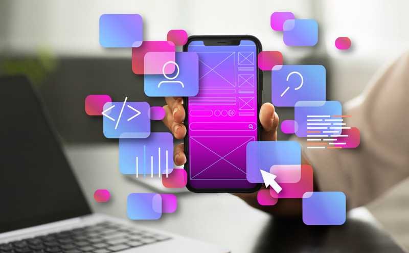
Following the development of visual mockups, the next phase involved the creation of a functional prototype in Figma. This interactive representation allowed stakeholders and users to experience the application’s flow, interactions, and usability before actual development.
Key Aspects of Prototype Creation:
Interactive User Experience: Using Figma’s prototyping capabilities, the prototype simulated the application’s functionality, enabling users to interact with elements, navigate through screens, and experience the flow firsthand.
Clickable and Navigable Design: The prototype allowed for clickable areas, transitions, and micro-interactions, providing a near-realistic experience of how the final application would function and flow.
User Testing and Validation: Conducting user testing sessions with stakeholders or target users provided invaluable insights into usability, identifying potential pain points, and validating design decisions.
Iterative Refinement: Feedback gathered during user testing sessions facilitated iterative refinements, allowing for improvements in user experience, navigation, and overall usability of the application.
Handoff for Development: The prototype served as a comprehensive reference for developers, providing a clear understanding of user interactions, navigation paths, and design specifications, streamlining the development process.
Stakeholder Buy-In: Presenting the interactive prototype to stakeholders facilitated discussions and buy-in, aligning expectations and ensuring a shared vision of the final product.
The prototype in Figma bridged the gap between design and functionality, offering a tangible and interactive representation of the application’s user experience. It allowed for validation, refinement, and seamless transition to the development phase, ensuring that the final product met user needs and expectations
19. Development

The frontend development phase was a collaborative effort between UX designers and frontend teams to ensure the seamless translation of UX design concepts into the application’s frontend. Throughout this phase, the involvement of UX designers remained pivotal, fostering continuous collaboration with the frontend team to ensure alignment with provided UX design principles and specifications.
Key Aspects of UX Designer Involvement:
Design Guidance and Consultation: UX designers provided ongoing guidance, clarifications, and consultations to the frontend team, ensuring a clear understanding and interpretation of the provided UX design elements, interactions, and user flow.
Consistency and Design Implementation: Collaborating closely, UX designers ensured consistency in the application’s frontend by regularly reviewing the implemented UI elements, ensuring they mirrored the envisioned design language, layout, and usability principles.
Interactive Elements and Functionality: UX designers collaborated to validate and refine interactive elements, transitions, and functionalities implemented by the frontend team, ensuring they aligned with the original UX design prototypes and user-centric interactions.
Usability Testing Alignment: Collaborating on usability testing sessions, UX designers and frontend developers collaborated to incorporate user feedback into the frontend development, refining the interface to meet user expectations and enhance overall usability.
Adaptation of Responsive Design: UX designers provided insights and guidance on responsive design aspects, ensuring the frontend development embraced adaptability across various devices while adhering to the established UX design principles.
This continuous collaboration between UX designers and frontend developers facilitated a cohesive approach, ensuring that the frontend development seamlessly translated the UX design’s visual and interactive elements. The concerted efforts resulted in an application frontend that not only reflected the provided UX design but also delivered a consistent and user-centric experience to end-users.
20. Product Launch
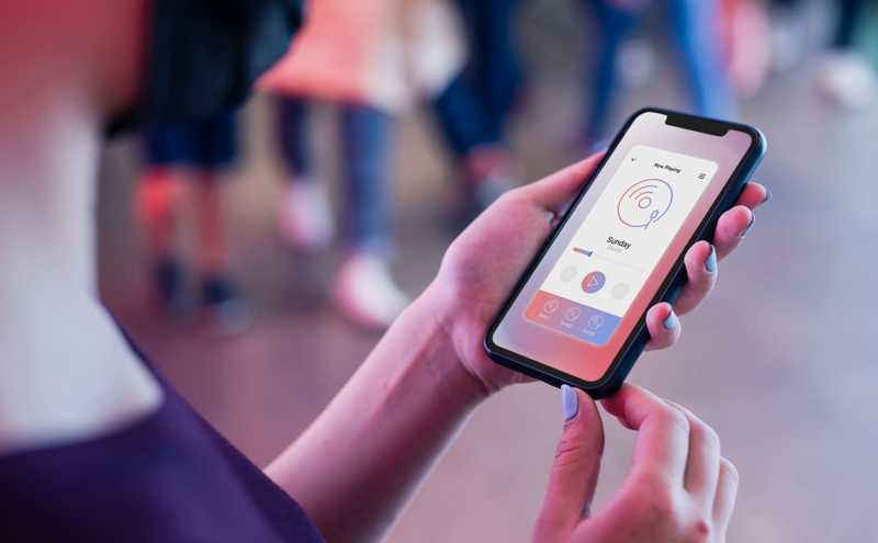
The product launch phase marked the culmination of extensive development efforts, signaling the introduction of the application to the intended audience. It encompassed a strategic and comprehensive approach to bring the application to market, ensuring a successful and impactful debut.
Key Aspects of Product Launch:
Marketing and Communication Strategy: A well-defined marketing strategy was formulated to create awareness and anticipation around the application’s launch. This included identifying target audiences, defining messaging, and selecting appropriate channels for promotion.
Beta Testing and User Feedback Incorporation: Prior to the official launch, beta testing phases were conducted, allowing a select group of users to explore the application. Feedback gathered during this phase was incorporated to refine the product further.
Stakeholder Engagement and Endorsement: Engaging key stakeholders, influencers, or industry experts facilitated endorsement and advocacy, building credibility and trust around the application.
Launch Event or Campaign: A launch event or campaign was orchestrated to generate buzz and attract attention to the application. This might involve press releases, webinars, demos, or other promotional activities to showcase the features and benefits of the product.
Deployment and Accessibility: The application was deployed across targeted platforms or app stores, ensuring accessibility to the intended audience. Appropriate distribution channels were utilized to make the product readily available.
User Onboarding and Support: A smooth and intuitive onboarding process was implemented to guide new users through the application’s features. Additionally, customer support mechanisms were put in place to address queries or issues post-launch.
Monitoring and Iterative Improvement: Post-launch, monitoring user engagement, feedback, and performance metrics was crucial. This data guided iterative improvements and feature enhancements to optimize the application’s performance and user satisfaction.
The product launch phase was a culmination of meticulous planning, collaborative efforts, and strategic execution. It aimed not only to introduce the application to the market but also to establish a strong foundation for continued growth and success in the evolving landscape.
21. UX Documentation
As the project concluded, the creation of comprehensive UX documentation served as a crucial step in archiving, consolidating, and preserving the user experience design journey undertaken throughout the project lifecycle. This documentation encapsulated critical insights, methodologies, and artifacts developed during the UX design process.
Key Components of UX Documentation:
Design Artifacts Compilation: The documentation encompassed a compilation of design artifacts, including wireframes, prototypes, user journey maps, personas, style guides, and other visual and interactive assets created during the UX design phases.
UX Research Insights: It documented key findings, observations, and insights derived from UX research, user interviews, usability testing sessions, and stakeholder consultations. These insights served as a repository of user needs, behaviors, pain points, and preferences.
Design Methodologies and Processes: The documentation detailed the methodologies, frameworks, and processes employed in the UX design journey. It outlined the sequence of activities, tools used, and best practices followed to achieve design goals and outcomes.
User-Centric Recommendations: Recommendations and actionable insights derived from UX analyses, including user personas, journey maps, and usability findings, were documented. These recommendations guided future iterations and improvements to maintain a user-centric approach.
Lessons Learned and Reflections: Reflections on challenges faced, successful strategies, and lessons learned during the UX design process were recorded. This served as a knowledge-sharing resource for future projects and team development.
Handoff and Collaboration Details: Documentation included details regarding handoff to development teams, collaboration approaches with frontend developers, and the alignment of UX design with frontend implementation.
Accessibility and Compliance Information: Details on accessibility standards followed and compliance measures undertaken to ensure inclusivity and adherence to industry standards.
The UX documentation provided a comprehensive and structured repository of the entire UX design journey. It aimed to preserve valuable insights, methodologies, and recommendations, facilitating knowledge transfer, continuous improvement, and serving as a reference for future UX endeavors.
IoT Blog
Be a part of the IoT revolution and share your ideas!
Finance
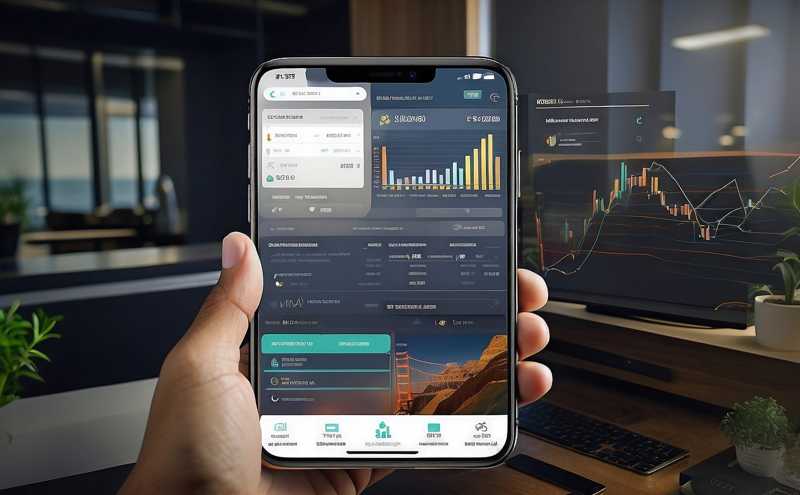
The UX design process for financial applications involves understanding the unique needs and expectations of users in the financial sector to create interfaces that are intuitive, secure, and efficient. This process typically includes the following key steps:
1. Research and Analysis: Conduct research to understand the target users, their goals, and the context in which they will use the financial application. Analyze competitors and industry trends to identify opportunities and challenges.
2. User Personas and Journey Mapping: Create user personas to represent different user groups and their characteristics. Develop journey maps to visualize the user’s interactions with the application, identifying pain points and opportunities for improvement.
3. Information Architecture: Design the structure and organization of the application, including navigation and hierarchy of information, to ensure that users can easily find what they need.
4. Wireframing and Prototyping: Create wireframes and interactive prototypes to visualize the layout and functionality of the application. Test these prototypes with users to gather feedback and make iterative improvements.
5. Visual Design: Develop the visual elements of the application, including color schemes, typography, and graphical elements, to create a visually appealing and cohesive design.
6. Usability Testing: Conduct usability testing with real users to evaluate the effectiveness of the design. Identify any usability issues and make necessary adjustments to improve the user experience.
7. Accessibility: Ensure that the application is accessible to users with disabilities, following relevant guidelines and best practices.
8. Security: Implement security measures to protect sensitive user information, such as encryption, authentication, and secure data storage.
9. Continuous Improvement: Monitor user feedback and analytics to continuously improve the application based on user needs and behavior.
Overall, the UX design process for financial applications focuses on creating a user-friendly and secure interface that meets the needs of users in the financial sector, helping them manage their finances effectively and confidently.
Travel

The UX design process for applications in the travel industry involves creating interfaces that make it easy and enjoyable for users to plan, book, and manage their travel experiences. This process typically includes the following key steps:
1. Research and Analysis: Conduct research to understand the needs, preferences, and behaviors of travelers. Analyze the competitive landscape and industry trends to identify opportunities and challenges.
2. User Personas and Journey Mapping: Create user personas to represent different types of travelers and their goals. Develop journey maps to visualize the user’s interactions with the application, from trip planning to post-trip activities.
3. Information Architecture: Design the structure and organization of the application, including navigation and content hierarchy, to ensure that users can easily find relevant information and complete tasks.
4. Wireframing and Prototyping: Create wireframes and interactive prototypes to visualize the layout and functionality of the application. Test these prototypes with users to gather feedback and make iterative improvements.
5. Visual Design: Develop the visual elements of the application, such as color schemes, typography, and imagery, to create a visually appealing and cohesive design that reflects the travel brand.
6. Usability Testing: Conduct usability testing with real users to evaluate the effectiveness of the design. Identify any usability issues and make necessary adjustments to improve the user experience.
7. Integration of Travel Services: Integrate travel-related services such as flight booking, hotel reservations, car rentals, and activities into the application, ensuring a seamless and integrated experience for users.
8. Personalization: Implement personalization features that tailor the user experience based on user preferences, behavior, and past interactions with the application.
9. Mobile Responsiveness: Ensure that the application is responsive and optimized for mobile devices, as many travelers use smartphones and tablets to plan and book their trips.
10. Continuous Improvement: Monitor user feedback and analytics to continuously improve the application based on user needs and behavior, and to stay competitive in the travel industry.
Overall, the UX design process for travel applications focuses on creating a user-friendly, visually appealing, and feature-rich interface that enhances the travel planning and booking experience for users.
Healthcare

The UX design process for healthcare applications involves creating interfaces that prioritize usability, accessibility, and security to meet the unique needs of patients, healthcare providers, and other stakeholders. This process typically includes the following key steps:
1. Research and Analysis: Conduct research to understand the needs, preferences, and challenges of users in the healthcare industry, including patients, healthcare providers, and administrators. Analyze industry regulations and best practices related to healthcare technology.
2. User Personas and Journey Mapping: Create user personas to represent different types of users and their goals within the healthcare application. Develop journey maps to visualize the user’s interactions with the application, from scheduling appointments to accessing medical records.
3. Information Architecture: Design the structure and organization of the application, including navigation and content hierarchy, to ensure that users can easily find the information they need and complete tasks efficiently.
4. Wireframing and Prototyping: Create wireframes and interactive prototypes to visualize the layout and functionality of the application. Test these prototypes with users to gather feedback and make iterative improvements.
5. Visual Design: Develop the visual elements of the application, such as color schemes, typography, and iconography, to create a visually appealing and intuitive design that instills trust and confidence in users.
6. Accessibility: Ensure that the application is accessible to users with disabilities, following relevant guidelines and best practices. This may include providing alternative text for images, ensuring keyboard accessibility, and using color contrast appropriately.
7. Security and Privacy: Implement security measures to protect sensitive patient information, such as encryption, authentication, and secure data storage. Ensure compliance with relevant regulations, such as HIPAA in the United States.
8. Integration with Healthcare Systems: Integrate the application with existing healthcare systems, such as electronic health record (EHR) systems, to provide a seamless and integrated experience for users.
9. Usability Testing: Conduct usability testing with real users to evaluate the effectiveness of the design. Identify any usability issues and make necessary adjustments to improve the user experience.
10. Continuous Improvement: Monitor user feedback and analytics to continuously improve the application based on user needs and behavior, and to stay current with advancements in healthcare technology.
Overall, the UX design process for healthcare applications focuses on creating a user-friendly, secure, and accessible interface that enhances the healthcare experience for patients, providers, and other stakeholders.
Public Sector

The UX design process for applications in the public sector focuses on creating interfaces that are accessible, inclusive, and efficient for citizens and government employees. This process typically includes the following key steps:
1. Research and Analysis: Conduct research to understand the needs, preferences, and challenges of users in the public sector, including citizens, government employees, and other stakeholders. Analyze government regulations and policies related to digital accessibility and usability.
2. User Personas and Journey Mapping: Create user personas to represent different types of users and their goals within the application. Develop journey maps to visualize the user’s interactions with the application, from accessing government services to submitting forms and requests.
3. Information Architecture: Design the structure and organization of the application, including navigation and content hierarchy, to ensure that users can easily find the information they need and complete tasks efficiently.
4. Wireframing and Prototyping: Create wireframes and interactive prototypes to visualize the layout and functionality of the application. Test these prototypes with users to gather feedback and make iterative improvements.
5. Visual Design: Develop the visual elements of the application, such as color schemes, typography, and iconography, to create a visually appealing and user-friendly design that reflects the government brand and values.
6. Accessibility: Ensure that the application is accessible to users with disabilities, following relevant guidelines and best practices. This may include providing alternative text for images, ensuring keyboard accessibility, and using color contrast appropriately.
7. Security and Privacy: Implement security measures to protect sensitive citizen information, such as encryption, authentication, and secure data storage. Ensure compliance with relevant regulations, such as GDPR in the European Union.
8. Integration with Government Systems: Integrate the application with existing government systems, such as databases and service platforms, to provide a seamless and integrated experience for users.
9. Usability Testing: Conduct usability testing with real users to evaluate the effectiveness of the design. Identify any usability issues and make necessary adjustments to improve the user experience.
10. Continuous Improvement: Monitor user feedback and analytics to continuously improve the application based on user needs and behavior, and to stay current with advancements in digital government services.
Overall, the UX design process for public sector applications focuses on creating a user-friendly, secure, and accessible interface that enhances the delivery of government services and information to citizens and government employees.
